It’s been awhile, but I’m back to for the second half of the discussion of provocative gore in art (Part 1 can be found here). Previously we looked at how Magic’s use of gore often relies of body horror and distortion of form to establish horror in its settings. FAB deploys its own graphic artwork in a variety of ways and in varying frequencies, and these are often different than Magic’s application. An interesting element of FAB’s use of gore is that it varies tremendously from class-to-class and really gives them distinct tones. I should note that there is also the additional layer of specialties which are linked not just to a class, but also a particular hero and region of Rathe. Let’s take a peek at the rest of the classes in no particular order and see if we can’t come up with some themes before looping back to generics and discussing the overall purpose of these art choices for the game.
Coming off the focus on Magic art, I do want to pause to note that while it’s not FAB’s main mode of gritty art, we do get a dash of body horror in the game, mostly courtesy of Runeblade.
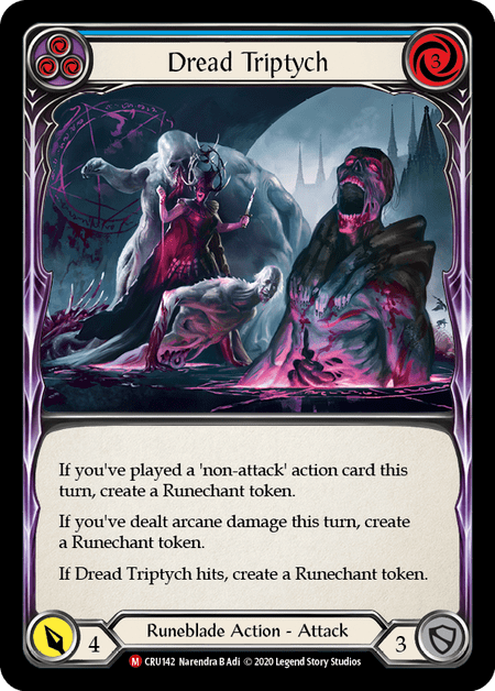
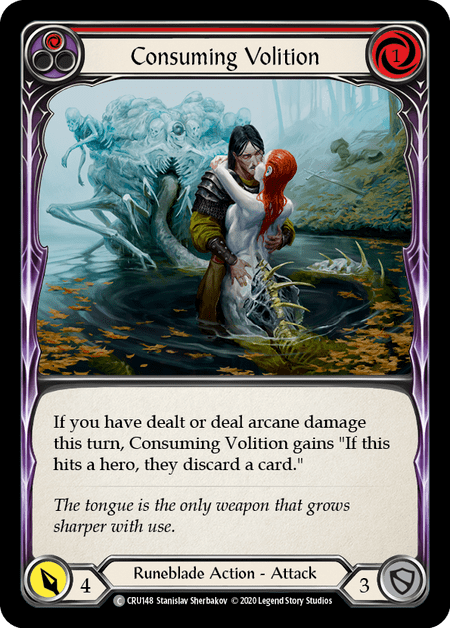

Consuming Volition in particular, has a nod to that blending of body horror and eroticism that I talked about with some of Maddocks’ art. It’s very “La Belle Dame sans Merci” through the lens of H.P. Lovecraft (I do wish they hadn’t gone for the joke in the flavor text here as it undermines the vibe). For FAB, these cards have really helped to set off the tone of the Demonastery and just the general weirdness of the Runeblade class. We also see the body horror elements carried over into the organic shapes of the Bloodsheath Skeleta which has definite notes of Soul Calibur’s Nightmare.

In the game’s fluff, the Demonastery leans heavily on gothic horror tropes of the haunted castle, a tradition that goes back to Horace Walpole’s The Castle of Otranto; meanwhile Sutcliffe is an echo of Frankenstein with Viserai his monster, “Lord Sutcliffe had at last found a vassal with enough strength to bear the agonizing procedure he sought to prove possible. Opening the chest cavity, he replaced viscera with an Arknight Shard, carved channels in bone to feed the arcane energy into runic vents etched into skin, and the first Arknight was born!”

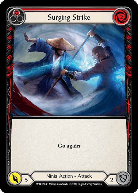
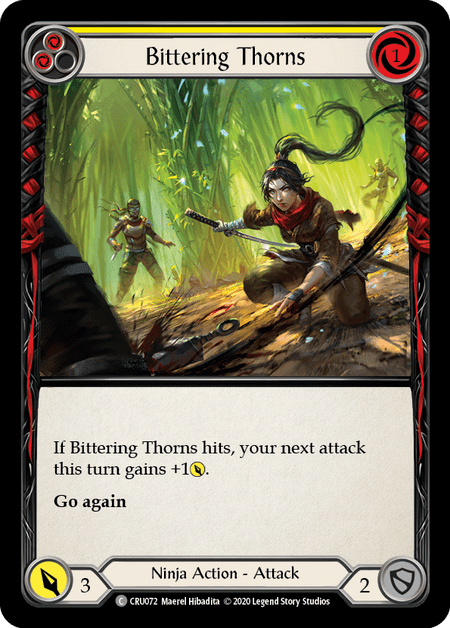
Like Runeknight, Ninja’s use of gore often comes off as an homage, in this case to cult kung-fu films. Ninja’s likes its violence to be stylistic. While Blackout Kick is undeniably gory, it’s stylized gore. The use of black and white art with a red blood spray pays homage to stylized martial arts violence and is reinforced by the flavor text which turns it into a visual joke, unlike the out of place Consuming Volition joke, this is entirely on brand for the source material. Surging Strike has a guy’s guts being blown out by a lightning punch with the blood being swept into a whirlwind, but that sounds way gristlier written out than what the art depicts, which puts the emphasis on motion and kinetic action more than its outcome, an approach that can also be seen in Bittering Thorns. Here the kunai is definitely drawing a gout of blood, but it’s all off the corner of the card and the emphasis is actually on Ira’s throw. Ninja cards convey motion and momentum, and when we do get gore, it’s most often in service of emphasizing the flow of action.


Warrior is sort of a fascinating case right now because it is, perhaps, the class with the least actual violence going on in its cards, which is a bit unintuitive. Maybe some of that is because Dorinthea reads more as a romanticized knight, and she sets most of the tone of the class. In fact, the only remotely graphic card by my estimation is Out for Blood, which notably features what I assume is a warrior from Misteria, based on the lacquered armor and Japanese-inspired sword (I don’t want to hear a debate on whether he’s holding a katana, a nodachi, or some other type of sword. I don’t care; take it to your own nerd blog). I think Out for Blood reads slightly more graphic than something like Push Forward because, while killing monsters usually reduces the impact of violence (we don’t have the same level of empathy for fictional monsters than we do for things like living people, dogs, etc.) the guy in Out for Blood is thrusting the grisly decapitated head right in your face. In this case, the art is reveling in the violence as opposed to accepting it as a necessary outcome of combat.


OK, I lied. Mechanologist is the most gore-free class. Which, makes a lot of sense, Dash is selling steampunk fantasy. Her character is evoking a more light-hearted theme than most of the rest of the heroes, and the cards reflect that. Managetic Shockwave has Dash blowing the armor and potentially grafted metal plates right off her opponent, but the mood is somewhere between comical with the surprised baddie in the background and joyous when you consider the look on her face. Cognition Nodes has a bit of body modification going on, but it’s not gnarly like what happens at the Demonastery. Teklo Foundry Heart is just here because I love it, and it’s one of my favorite cold foils and by far my favorite RF take on an L, in that it’s different than the CF but also still really good, whereas some of the others feel more lacking.
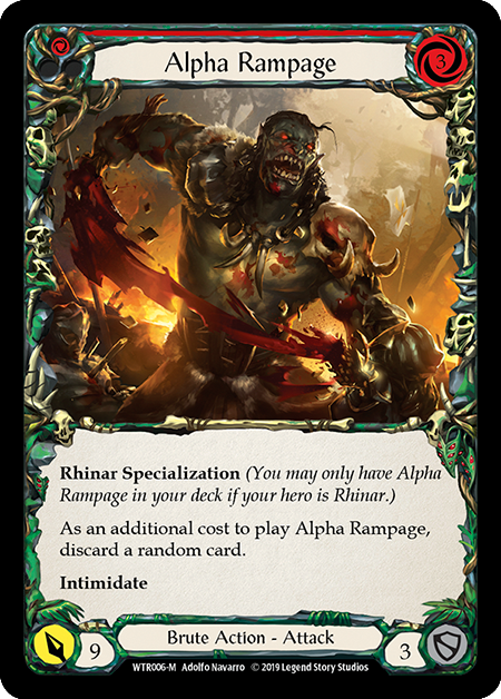


I think, most people would default to Brute as the goriest class, but I find that there are mitigating factors. Brute is very in your face with its ribcages everywhere and entrails strewn around like garlands, but ultimately that ends up becoming over the top and feeling almost cartoonish in the way that Mortal Kombat’s hyper violence often goes past wince-worthy and loops to mildly comical. Alpha Rampage mutes its gore with stylized art that renders the blood from the torn arm as a bright ribbon of color. It’s certainly violent, but it’s stylized. Meanwhile, Bloodrush Bellow and Massacre just ramp it up to 11 and make the gore unrealistic with how extreme it ends up being. It’s the feel of an over-the-top splatterhouse flick with buckets of blood and a frankly suspicious amount of entrails. This works for brute though. The tone of the class becomes over the top; it’s very much a teenage boy’s conception of a really metal album cover.
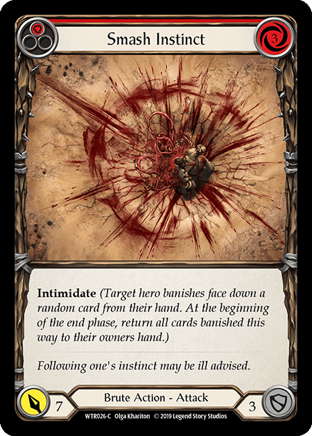
I do want to spare a moment for Smash Instinct which is my favorite artistic bloody card in FAB. This was definitely one of the cards that I paused on when breaking open my first WTR box. I don’t know that the splatter pattern would pass muster for a forensics expert, but the card does do a great job of conveying the extreme violence of the brutes while still being an attractive composition. The mechanics of how whatever happened there happened don’t make a whole lot of sense (it looks like the smashee was exploded from the inside), but I also don’t care. The overhead view serves to convey the scale of the carnage (that crater!)


Speaking of long range views of violence, Wizards identity as it relates to its displays of violence have two modes: close up and zoomed way out. Cindering Foresight stands alone as the main example of the former category. We’ve got the traditional fantasy wizard burning someone to bone art, but FAB makes it a bit of a grittier by leaving enough of the poor guy’s face intact to make out his anguished features. The more notable category to me are the large scale shots like Scalding Rain and Lesson in Lava. These are pulled out far enough that we don’t get any real detailed views of individual ghastly deaths, but the tradeoff is a sense of the scope and scale of wizardly power. Whereas most of our other classes are up close and personal, this art starts to define wizard as a class that causes damage on a much bigger scale.

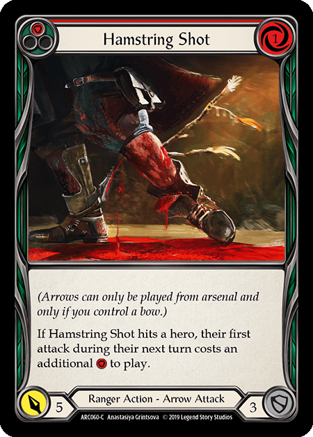

We saved the two big classes for last here. If ranger is selling one thing, it’s that life in The Pits sucks hard (If it’s going for a second, it’s probably that Azalea is a stone cold murder machine). Head Shot and Hamstring shot, aside from looking great in foil, really drive home the visceral damage that the arrows are doing. The framing is close up in both cases, focused in on the body part being hit and just far enough out to show you a healthy (well probably unhealthy) amount of blood. Tripwire Trap, meanwhile, gives us both body horror in the form of whatever that shambling abomination is, and brutal dismemberment in the form of the damage being done by the trap. It’s interesting that a class that fights from a distance has so many cards with close up depictions of gore. This is perhaps because Ranger’s cards, to this point, are selling a very Pits-centric nightmarish hellscape, and it will be interesting to see if a future Ranger character from a different area of Rathe shifts the art style in a new direction. Which brings us to the starkest juxtaposition of flavor and art…
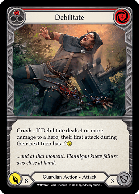

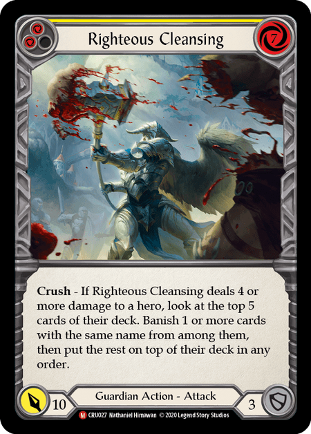
If you’ve read the fluff or paged through the lore book (or even just looked at the art of Tunic, Coax a Cheer, Bravo, etc.), you, like me, might have an image of Aria as a lovely magical fairyland, and that makes the utter savagery of some of the Guardian art so striking. WTR was relatively mild graphic violence like Cartilage Crush or Spinal Crush (they used “crush” WAY too much in WTR) which depict violence that would likely be a lot harsher than it appears on these cards. But then we get Debilitate, and just, wow, yikes. I did a double take when I first saw it; yeah that was a giant sledge just pulping that dude’s hand. More than anything, this card was the one that made me pause and realize that FAB was going for a decidedly different vibe than most other fantasy settings, though again, the use of a joke to undercut the visceral violence makes it feel somewhat tentative. After CRU landed and we got the pair of Mangle and Righteous Cleansing, Guardian easily became the class with the most brutal violence in my book. One thing does stands out about Guardian’s violence, particularly in light of Mangle’s flavor text, it occurs in the context of mercilessly killing aggressors. It feels like Guardians are inflicting this traumatic violence as sort of deterrent –they’re meeting transgressions with overwhelming force.
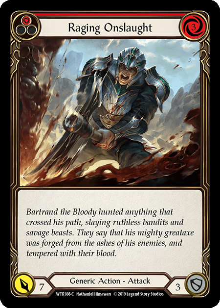
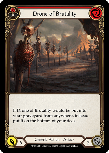

Let’s wrap up with a grab bag of generics and then close things out. I feel like the first couple of these are a kind of wink and nod gesture to the inclusion of gore in the game. Raging Onslaught is a guy hewing something in half with flavor text that essentially boils down to “Jim Muderson murdered everything and then built an axe from their remains to keep murderin!” Drone of Brutality is a complimentary nod in a different direction – just endless rows of skulls and guts-stuffed ribcages as far as the eye could see. Droning, monotonous, common place brutality is the way of things in Rathe. These cards, to me, are really trying to establish this as the background tone for the game as a lot grittier than a setting like Magic, though more restrained something like 40k where it goes so over-the-top it ends up reading as juvenile (see Brute). Finally, we have Snag, which is the card I most often see sighted (see what I did there… I’m sorry; that was awful) as the card that pushes the line of too much gore. I think it works because it looks rough at a glance, but it doesn’t really sink in until you look closer and see the eyeball.
What we can see across these classes is that FAB uses fairly diverse representations of violence to help define its world, its classes, and its characters against one another. While it does dabble in body horror, most of its usage is on a sliding scale of straight up gore where we have something like Mechanologist on one and representing effectively no graphic violence to Guardian on the other end showing very graphic bloody violence that is being taken very seriously. (If you’re curious, Brute is beyond the end of the scale in what we can call the “40k zone”). One of the most interesting questions to me, as the game continues to grow and the cast of heroes expands is: “will the class identities outlines above remain intact, or will shift as characters from other regions begin to see more representation in their class’ art? That is, if she gets more cards, will Kassai’s art have a different tone than Dorinthea’s?” I suppose this is just one more thing to occupy my thoughts during what seems like a glacial wait for Monarch.
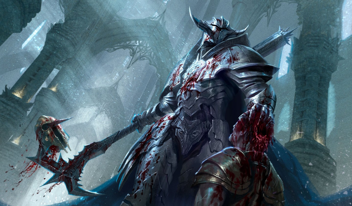
*Header Image: Mangle by Federico Musetti
