From a financial angle, I felt like Everfest was pretty bad and there’s a lot to critique there. But lately I’ve been mostly writing critical stuff, and I don’t spend enough time talking about things I actually like. So let’s push FAB 2.0 off to the side, and go back in time a couple months. I’ll give you a scenario. Everfest just came out, and you’ve got cards to open. However, a freak cosmic occurrence has rendered the Internet inaccessible, so you have no way of viewing the cash value of the set. Congratulations, you’ve got some time to enjoy the set for its merits before you realize that you’ve lost like 60-70% of what you spent on those boxes. Alright, have you put yourself in that headspace? Excellent, let’s talk about all this cool stuff in Everfest!
The Packaging, Though
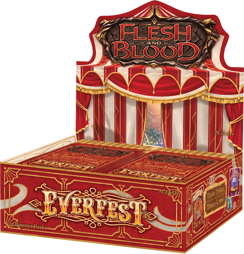
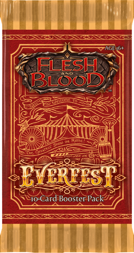
Now this is some nice packaging design! I mentioned a while back that I liked the look of the Everfest mockups. The box folding out the tent with the posters on the side is all lovely and totally captures the vibes they’re clearly going for. The real surprise to me was how nicely the paper wrappers played into it. The visual design with the stripes, hand-drawn feel, and the tactile paper element really just gave the mood of opening some sort of carefully hand-packaged envelope. I feel like, out of the gate, LLS’s box design was kind of drab and didn’t really stand out against the boxes for other games on my shelves. And the aesthetic competition on those shelves is not that high –Magic booster boxes are pretty bland and safe, and Keyforge are messy. But LSS has really picked up their game from Monarch forward, and I’m legit excited to see what Uprising’s packaging looks like, which is not something that I can remember thinking about a CCG before. While I would still say Tales of Aria is my favorite box design, when you consider the box and its contents as a single item, Everfest takes the cake.
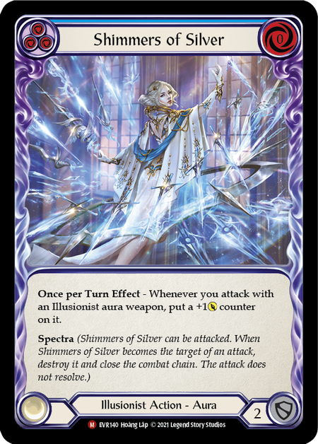
Illusionist Gets All the Pretty Things
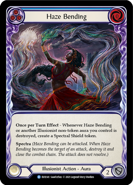
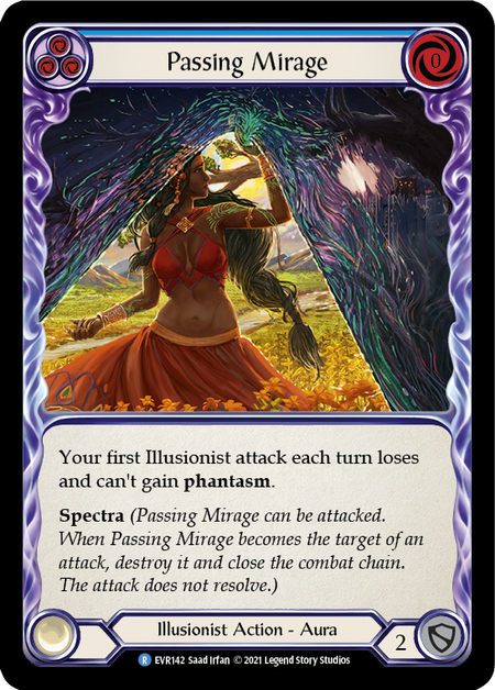

Can we just talk about how Illusionist gets so many stunning cards that deviate sharply from the sort of generic style fantasy art that overpopulates the fantasy genre? Eleonor Piteira’s trio of Auras were among the best pieces in Monarch, and I feel like Saad Irfan’s Aura trio deserves to stand right next to them. There’s such a wonderful sense of motion in them and a beautiful use of color. Illusionist has really won me over as a class, and I think part of it is how it gets a totally disproportionate chunk of each set’s best art. The only downside is that I still have to buy my set of EA Wartune Heralds, and now I need these in cold foil too. Speaking of beautiful art from Saad Irfan,
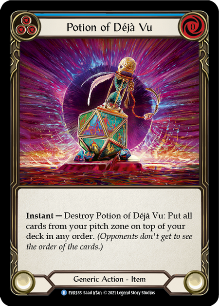
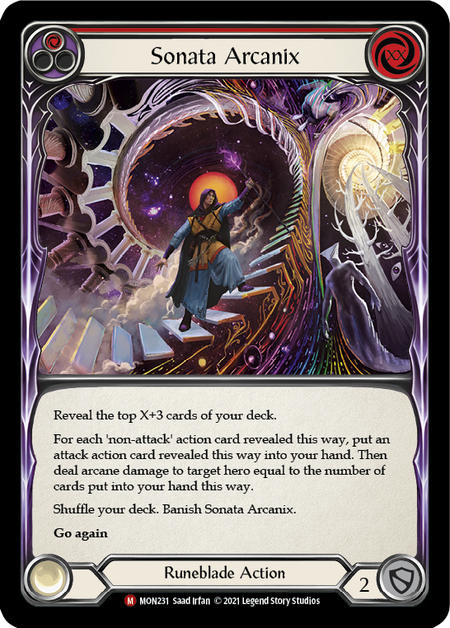
Potion of Déjà Vu is really pretty, particularly in cold foil. Sonata Arcanix was a standout piece of art from Monarch, and with these new pieces, I hope that we continue to see more stuff from Irfan in future sets.
Now I’m Just Thirst Posting

Special thanks to Phu Thieu for Swarming Gloomveil which is, in my heart, the spiritual companion piece for his art on Exude Confidence. Both arts belong to that cherished genre of powerful, attractive curvy women who give the strong impression they would destroy me.
Bravo, Star of the Show
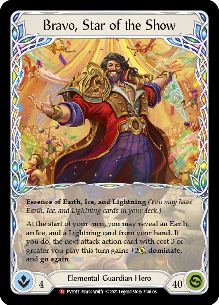
I don’t care that he is apparently “too easy” to play. I don’t care that he’s going to be illegal to play on Classic Constructed any day now. I don’t even really care that “Starvo” is a dumb nickname. I care that they did the thing I said I wanted them to do! We got full art heroes, everyone! They’re even better looking than I imagined. (Note, LSS had clearly ordered these before I wrote that article, but I was so excited when I wrote a thing being like “here’s this very specific thing I want them to do” and then it showed up a couple months later.) Anyway, now all they have to do is start releasing one of them for every hero in every new set (like seriously, LSS, this is the easiest freebie out there towards helping ameliorate your low EV booster box issue). The pain of the fact that I’m probably not ever going to own a a set of the ARC/WTR CF Adult heroes is also slightly reduced by the fact that they’re not full art, and thus not as fabulous as the Bravo treatment looks.
The Variants
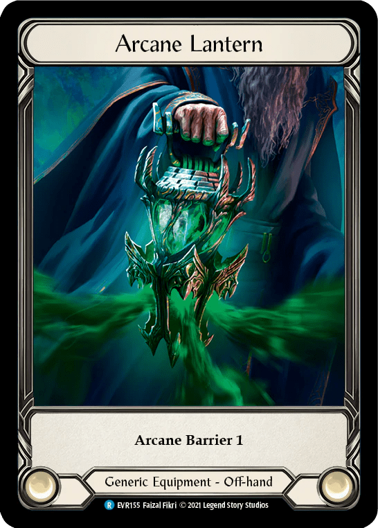

The addition of more cards that are “hits” of varying levels is a definite improvement over previous sets. Stuff like Earthlore Bounty and Arcane Lantern are the clear standouts as the full art treatments really look good and make for a notable improvement over the normal versions of the cards. The EAs are fine, they definitely add value to the box compared to their normal rf counterparts, but I’ve never personally been blown away by LSS’s EA treatments. Yes, they look cooler than the normal cards, but it’s a relatively minor improvement. Magic’s recent extended art cards do this a fair bit better by clearly showing more of the art than the normal version, but FAB can’t copy that due to importance they place on border design. So, I guess I’m excited that some effort is being put into making packs have more cards that could help pad out value, and I love the full arts, but I’d like to see LSS maybe iterate on other ideas or do something more interesting with extended arts going forward. Hopefully Marvels will impress in this regard.
Some Character Development
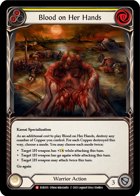


Long time readers know that one of my frequent complains has been LSS missing the opportunity to develop their characters on cards via the flavortext and to a lesser degree the art. Everfest does a better job of using these opportunities than other recent sets. Blood on Her Hands is a super evocative art that tells a story and gives insight into Kassai’s character. I feel like the reflection of her face is ambiguous enough that it lets you read different things into her expression. What do you see when you look at it? –is this a somber reflection on the cost of her revenge? Is she coldly reflecting on the day’s battle? Is it grim determination? Does reading her flavortext quote from Outland Skirmish impact how you think about it? I’d also be remiss not to mention my preview card here, I wrote about that one in a lot more depth there, but hey, it’s my blog, so I can plug old content if I want
Runeblade Art!
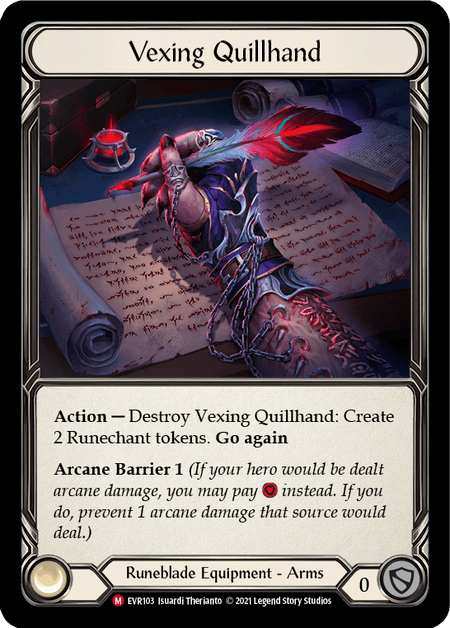

I called out Illusionist earlier, but if there’s another class that give is run for its money, it would be Runeblade. Runeblade also gets a fair share of art that moves beyond the sort of core “look” of FAB art. Runeblood Incantation’s limited color palette is quite striking, and I’d love to see it get the CF treatment as a promo just on the basis of how good it would look. Meanwhile, the continued use of body horror as a core aesthetic of generic and demonastary-aligned Runeblade cards really helps to build the unique identify of the class. Quillhand is just a fascinating card from the conceptual end – the integration of equipment into the body has been a consistent element in a lot of Runeblade art, and it’s both creepy and badass.
Timekeeper’s Whim
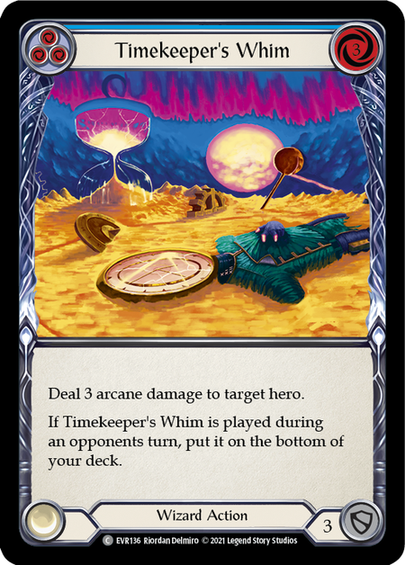
I’m still not entirely sure how I feel about this card art on like a personal aesthetic level, but I’m very happy it exists in the game. As noted in many of my other art discussions, I tend to have a heavy preference for art that is proactive, stylistically distinct, and/or challenging. These are usually the sorts of pieces that people have strong opinions on both positive and negative. Good art should get people talking, and I’m happy that LSS has continued to include pieces from artists that might not be what people expect to see when they open a pack of cards for a fantasy CCG. This is the sort of piece that you can have a conversation about that extends beyond “I like it” or “I don’t”.
Coins Continued
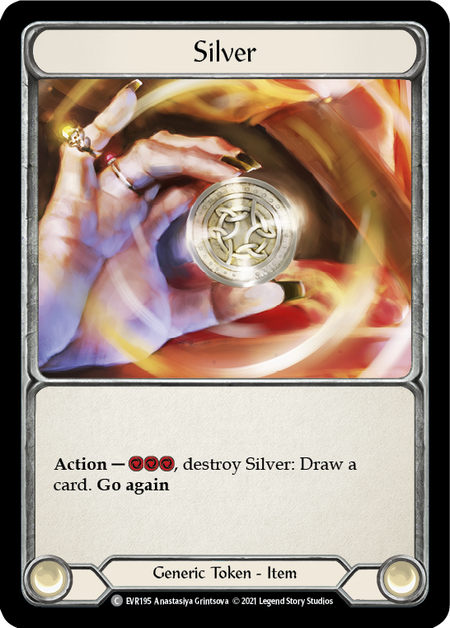
Hey, it’s a tag up on the coin resources from CRU. I think we can see the mechanical progression here now (presumably gold costs 2, and platinum -or some other metal- costs 1.) There isn’t a lot more beyond that, but the tease of the mechanic is sort of a note that we’re still going to do this mechanic at some point. It feels like it might be tied into places like the Pit and Volcor, and I’m imagining a sets that feature one of both of those regions and uses the coins to mechanically push the narrative of mercenaries, assassins, and/or monster hunters.
Brute Confusion
So, Everfest has really made me question what’s going on with brutes. But an exploration of my thoughts on this topic ended up leaving their appearance in Everfest a thing I am cautiously positive about as opposed to a “favorite thing”. That thought process also got kind of long, so it turned into its own article, because, of course it did.
Developing a Stable of Artists
I talk about Magic fairly regularly in my articles both because it’s a game that I’ve been playing on and off since I was 1997, but also because a lot of the art in that game really shaped my tastes. My mom is a huge art lover. She’s volunteered for Art Goes to School since I was in elementary school and continued even after my younger siblings and I were adults. Art museums were frequent stops during my childhood, and I’m sure my tastes also owe some credit to her interest in surrealism and impressionism, but as I got older finding my “own” artists became a thing. And since I grew up in the backwoods of Pennsyltucky and the Internet was young, a lot of my opportunity to encounter new art came from playing CCGs.
Back in those days, Magic’s art was sort of like the wild west; if felt like anything went. And while that sometimes meant you got some poorly executed art, you got a whole lot of weird and wonderful pieces before the game got big and the art styles became more homogeneous. Artists like Anson Maddocks, Rebecca Guay, and Richard Kane Ferguson (among many others) were putting out awesome pieces that you knew at a glance were theirs. That sort of recognizable style is something that I really value in art – which isn’t to say that artists can’t evolve. Rebecca Léveillé’s (as Guay credits herself these days) current art definitely shows some stylistic evolutions from the art she was doing on Magic cards in the 90s and 2000s, but I still adore it and could pick one of her pieces out of a lineup in my sleep. All of that is to say that, as FAB grows, I’m looking for artists that make standout pieces with a distinct style that we get to see more of set-after-set. I mentioned Saad Irfan’s art earlier, and he’s certainly on that list, but Everfest has some pieces from other people who are starting to come together on the preliminary list of iconic FAB artists that I’m drafting in my mind.

Othon Nikolaidis is one of those. Nikolaidis’ FAB premiere was Lumina Ascension in Monarch, which remains the best depiction of Boltyn in game and an all-around stunning piece. I’m always impressed by digital artists who can get a real sense of texture into their art, because they’re doing it without the help that the physicality of actual paint gives you. There are a lot of aspects of his work that I could gush about, but the one I want to focus on here is how much detail he puts into pieces where you can really get away with cutting some corners.

So, let me take a minute to expand on that. When you look at the art of a FAB card, it’s fairly small. That means that the actual piece of art doesn’t need a ton of fine detail because it’s not going to be legible at the size the card is printed –obviously if the art is going to be used on a playmat or in promotional material this can change, but for art that’s mainly going to be on physical cards, you can have “looser” detail. That’s not a knock on artists that compose pieces that way, it makes perfect sense if your composing it for the purpose of appearing as a small rectangle on a card, and there are also plenty of stylistic reasons you might choose to do so. What always gets me about Nikolaidis’ art is that it looks great on the card, it looks great at desktop size, and it looks great when you zoom in. I think it takes a lot of skill to accomplish that. He’s also got range in terms of subject matter.


In Everfest alone, you’ve got Blood on Her Hands, which I mentioned earlier. There is a neat take on a still life in Veiled Intentions. Sigil of Parapets does a good job of rendering an action scene and making a magical attack and defense feel like they have actual weight to them, not to mention the interplay between the vertical lines and the circular motifs. And Thunder Quake is a really nice study in what you can accomplish with a limited color palette (and actually reminds me a little of some of the aforementioned Richard Kane Ferguson’s art).

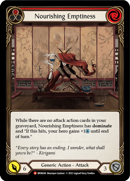
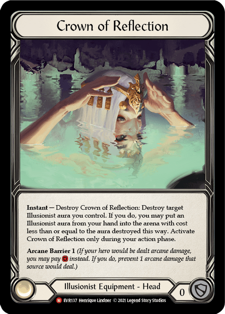
There are some other artists that feel like one or two more good pieces in future sets could push them into my favorite FAB artists list. Henrique Lindner’s Runeblade cards are standouts (I talked about Runeblood Incantation earlier, but he also did Vexing Malice in Monarch). All of his work is good, but the other notable ones for me are Nourishing Emptiness and Crown of Reflection.
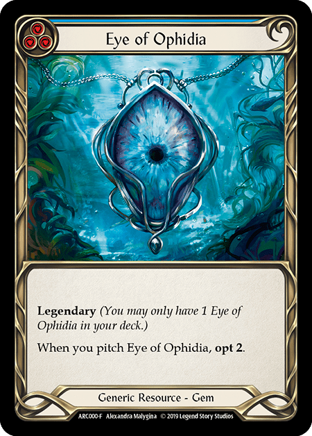
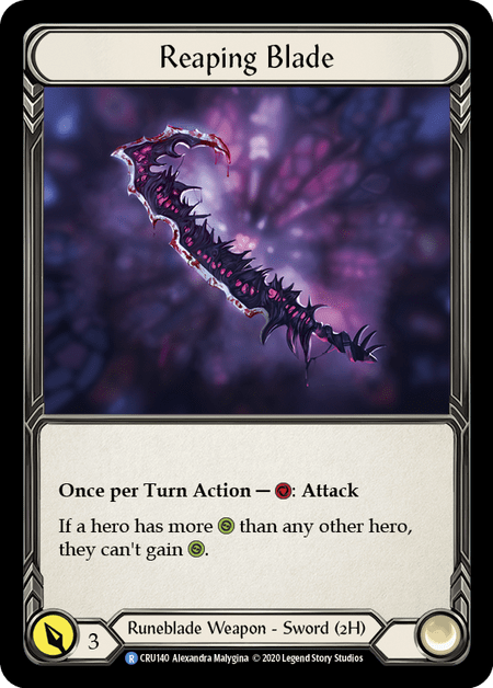

Alexandra Malygina is another artist in that tier. She’s responsible for the best looking Fabled in the game in Eye of Ophidia. Potion of Seeing has a really cool, somewhat creepy eyeball design that I love. Also there is a tentacle hiding in the background opposite some sort of horrifying furby-looking creature in a jar that got cropped out of the actual card. She also did the very rad art for the Fate Foreseen promo, which I sadly do not own any of. And she did Reaping Blade, which, to me, is the most visually iconic Demonastry Runeblade weapon.
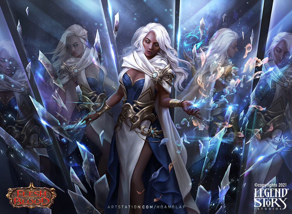
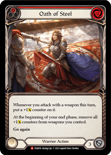
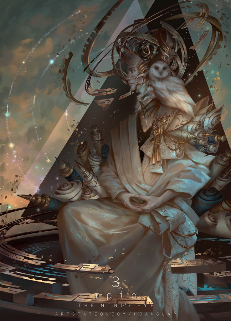
I’ll round this group out with Hoáng Láp, who only has four FAB cards to far, three of which are in Everfest, and they all slap. Like, just really beautiful art across the board on these three:

Looking at his portfolio on ArtStation, he also has some really stunning pieces with surreal notes that suggest a stylistic range I would love to see LSS utilize for something Runeblade or Illusionist related.

Show’s Over
So, yeah, Everfest. Once you set aside the financial component, it had a lot of cool stuff going on that got somewhat lost in the discussions of tanking card prices and how many boxes were sitting on shelves at MAP (or below, on the DL). I think that there are productive elements in here that can be built on in future sets. Maybe it’s apt that the circus-themed set is the one where, if you can sit back and stop obsessing over whether the knick-knacks you’ve acquired are worth the money you paid, you’ll find that there’s actually a lot fun colorful stuff to enjoy.
*Header Image – Fractal Replication by Hoàng Lập
